Exploring the Best Note-Taking Apps on iPad: A Deep Dive
Written on
Evaluating iPad Note-Taking Apps
With an overwhelming number of note-taking applications available in the App Store, many claim to deliver the ultimate writing experience. But how do they truly measure up to the simplicity of using a pen and paper?
The appeal of a traditional notebook lies in its convenience and familiarity: just grab your notebook from your bag, pull out a pen, flip to a blank page, and start jotting down your thoughts. The seamless integration of writing and sketching is another significant advantage.
While I won't delve into the merits of digital notes—aside from perhaps noting their easier backup and search capabilities—I aim to evaluate how closely several iPad apps replicate the simplicity of writing on paper.
To do this effectively, my assessment will unfold in two phases.
In the first phase, I will score seven different apps on a scale of 1 to 5 based on their overall viability. This will serve as a preliminary sanity check.
Phase two will involve a more in-depth exploration of the top three apps, where I will take notes on the Double Slit experiment and provide commentary on each app's strengths and weaknesses. Screenshots of my notes will be included, along with downloadable PDFs of each app's output available on my website.
Note-Taking App Evaluation Criteria
To accurately gauge how well a note-taking app can mimic the experience of a pen and paper, several important factors will be considered:
- How many taps are required to transition from launching the app to writing on a new virtual page?
- Does the app efficiently and elegantly map the page size to the screen?
- Is it easy to write at an appropriate size for the selected page?
- Are there any latency issues? Does the virtual ink appear immediately at the right spot on the page?
- How well can diagrams and text be combined?
Given the extensive range of note-taking apps available, this evaluation may take time. To streamline the process, I'll conduct a simplified test by writing the opening lines of the poem "Ozymandias" by Percy Shelley:
I met a traveller from an antique land,
Who said — “Two vast and trunkless legs of stone
Stand in the desert.”
This test will allow me to score each app out of 5. In cases where there are ties, I'll reference App Store reviews for further insights.
Why "Ozymandias"? Simply put, it's a poem I enjoy.
The Double Slit Experiment: A Brief Overview
The Testing Setup
My testing setup included an iPad Pro 11” (2022), an Apple Pencil (2nd generation), and a PaperFeel screen protector. All evaluations were conducted in landscape orientation.
Initial Candidates for Evaluation
The following apps were tested, with scores reflecting their App Store ratings:
Apple Notes (iPadOS 17)
Thanks to Apple’s unique position as the developer of iPadOS, I could easily launch Notes from the lock screen. The app created a blank note immediately, allowing me to start writing right away. The lined page provided a clear sense of writing size.
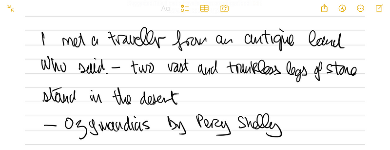
Overall, this app scored a perfect 5 out of 5.
Kilonotes — Notes and PDF Reading (4.7/355 reviews)
Upon launching Kilonotes, I was greeted by a book cover metaphor. After swiping, I found a page to write on, though it felt smaller than Apple Notes. The user interface was somewhat cluttered.
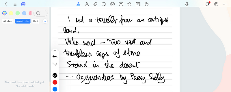
I rated this app 2.5 out of 5 due to its cramped feel.
Notability (4.7/25K reviews)
Notability launched smoothly, creating a note for me named with the current date and time. The writing experience was fluid, and I had complete access to the screen width, though the page wasn't lined by default.
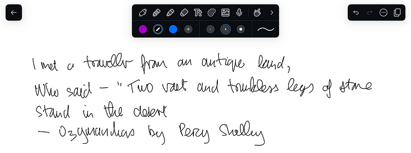
I gave Notability a score of 4.5 out of 5.
GoodNotes (4.7/27K reviews)
GoodNotes also launched seamlessly, allowing me to create a notebook with various covers and page layouts. I was able to write comfortably across the full screen.
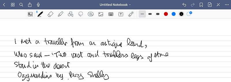
This app earned a solid 4 out of 5.
CollaNote (4.8/1.6K reviews)
CollaNote offered a Quick Note feature, but I noticed that the default pen color was not black, which made it difficult for me to read.
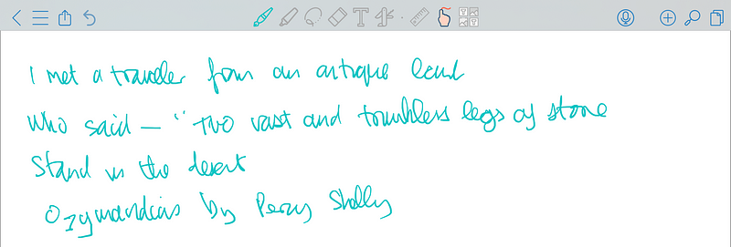
Despite this, I scored it 3.5 out of 5 for its overall functionality.
Nebo (4.6/5.7K reviews)
Nebo required me to create a notebook before writing. The initial setup was a bit cumbersome, but once I was in, the writing experience was satisfactory.

I rated Nebo 3 out of 5.
Microsoft OneNote (4.6/159K reviews)
Accessing Microsoft Notes was somewhat tedious. After logging in and creating a notebook, I finally reached a page where I could write. The overall experience was good, despite the initial hurdles.
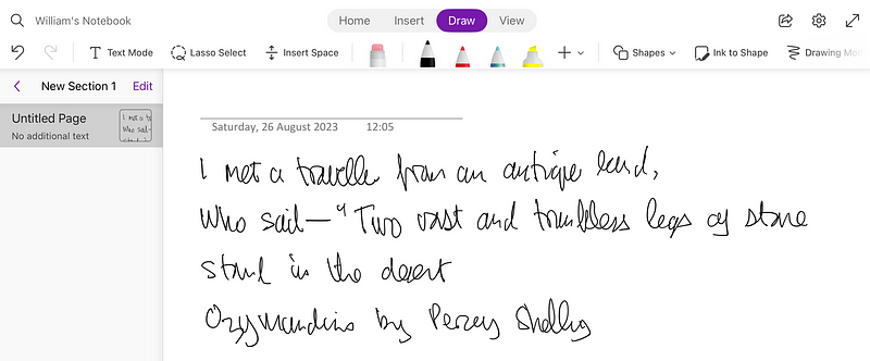
This app received a score of 3.5 out of 5.
Round 1 Results
Scores from the initial round are as follows:
- Apple Notes — 5
- Kilonotes — 2.5
- Notability — 4.5
- GoodNotes — 4
- CollaNote — 3.5
- Nebo — 3
- Microsoft Notes — 3.5
This means Apple Notes, Notability, and GoodNotes advance to the next round.
The Double Slit Experiment with GoodNotes
GoodNotes opens with a full-page view, which can be adjusted for readability in landscape mode. Writing with an Apple Pencil felt intuitive, and tools were readily accessible.
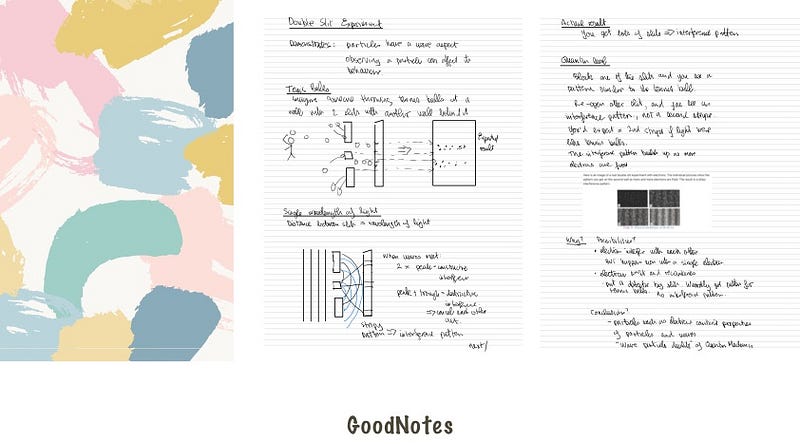
You can download the complete PDF from my website via this link.
The Double Slit Experiment with Notability
Notability's interface fills the screen, making it easy to zoom in and out. The compact tool panel allowed for a smooth writing experience.
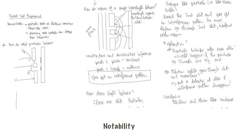
The full PDF can also be downloaded from my website.
The Double Slit Experiment with Apple Notes
Apple Notes launched into a lined page, making it easy to begin writing. However, the lack of zoom functionality posed a significant limitation.
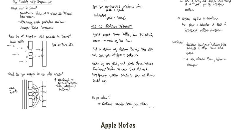
Again, you can find the PDF available for download on my website.
Conclusion
If Apple Notes had a zoom feature, it would have been the clear winner due to its seamless integration with iOS/iPadOS. While Notability and GoodNotes both excel, I personally prefer GoodNotes for its horizontal page navigation, which closely resembles using a physical notebook.
In 2023, it’s surprising that Apple Notes still lacks such a fundamental feature.
Stay updated with my latest articles and receive a free guide to Apple Notes by subscribing to my newsletter!