Exploring 6 Notable Design Systems for Enhanced User Experience
Written on
Chapter 1: Understanding Design Systems
Let's take a closer look at some of the most popular design systems currently in use.
Section 1.1: Material Design
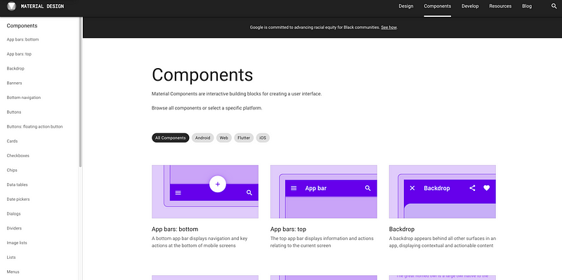
Material Design is a design framework introduced by Google in 2014. This system builds upon the "card" layouts that were first showcased in Google Now, incorporating grid-based designs, dynamic animations, and depth effects like shadows and lighting.
Material Design is an open-source system that aids teams in crafting high-quality digital experiences. In 2018, Google announced enhancements to the language, granting designers greater flexibility to create custom themes featuring diverse geometries, colors, and typography. The Material Theme Editor was also released for the macOS design app Sketch.
By 2021, the revamped design language was adopted across most of Google's mobile apps for Android, as well as their web counterparts, including Gmail, YouTube, Google Drive, and many more. Notably, it serves as the primary design language for both Android and Chrome OS.
In this video titled "What is a Design System? 6 Different Types of Design Systems," we explore various design systems, including Material Design.
Section 1.2: Fluent Design System
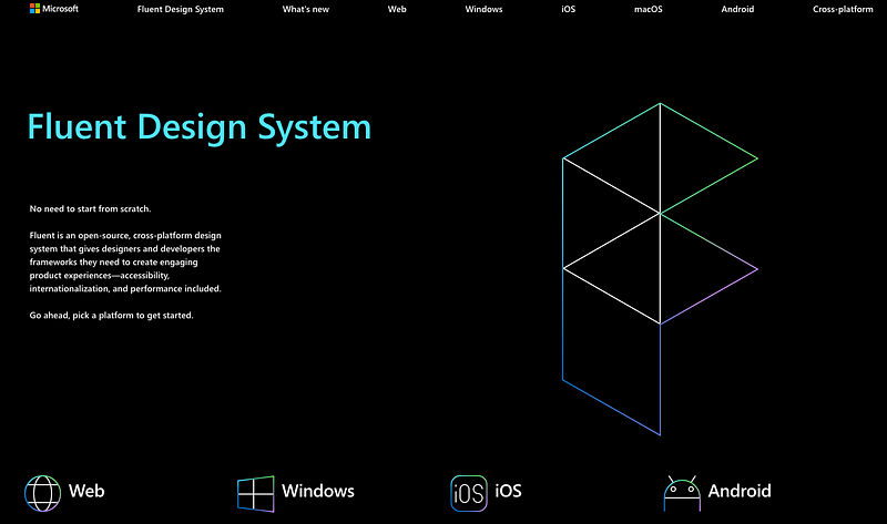
The Fluent Design System, launched by Microsoft in 2017, is a redesign of the earlier Microsoft Design Language 2 (commonly referred to as “Metro”). This design language provides guidelines for software design across all Windows 10 devices and platforms.
Fluent Design is characterized by five key elements: Light, Depth, Motion, Material, and Scale, emphasizing a more significant use of motion, depth, and translucency effects.
Section 1.3: Carbon Design System
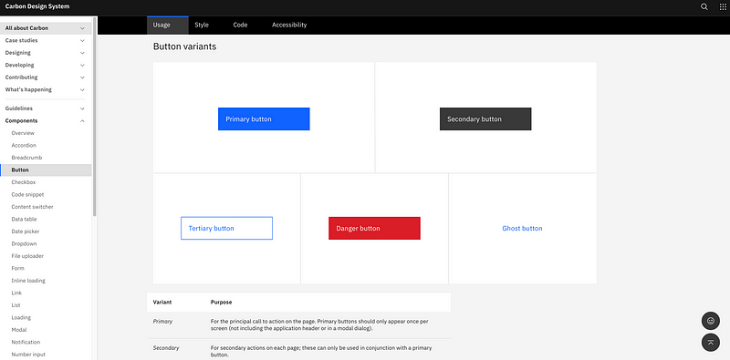
IBM's Carbon Design System is an open-source framework designed for products and digital experiences. Built on the IBM Design Language, it comprises working code, design resources, human interface guidelines, and a vibrant community of contributors.
Carbon is primarily supported by IBM, which allows it to tailor its features to meet the company's business needs while benefiting from a dedicated team of engineers and designers focused on its enhancement. The system aims to enhance UI consistency, streamline the design and development process, foster a shared vocabulary between designers and developers, and provide clear guidelines on best practices.
Section 1.4: Spectrum Design System
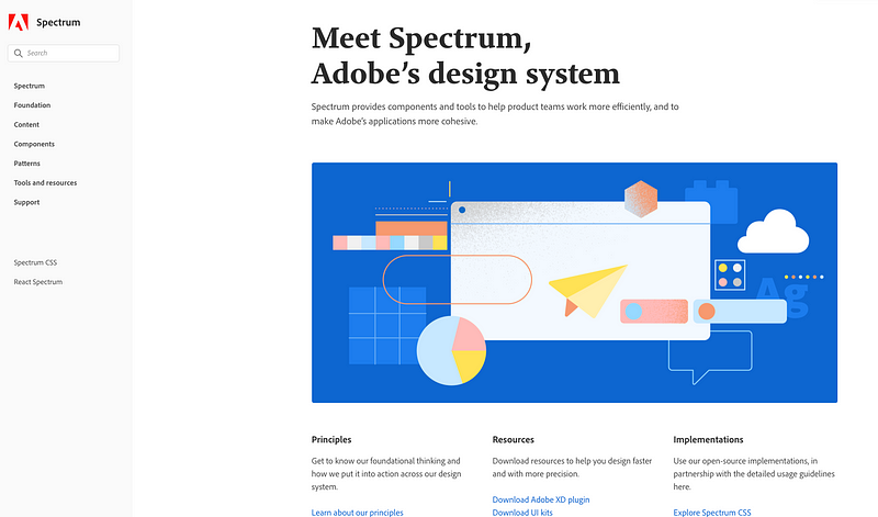
Adobe’s Spectrum Design System establishes a framework for delivering cohesive, collaborative, and user-centered cloud experiences. Spectrum transcends mere visual consistency; it introduces a comprehensive set of experience guidelines for creating Adobe applications and services.
Section 1.5: Apple Human Interface Guidelines (HIG)
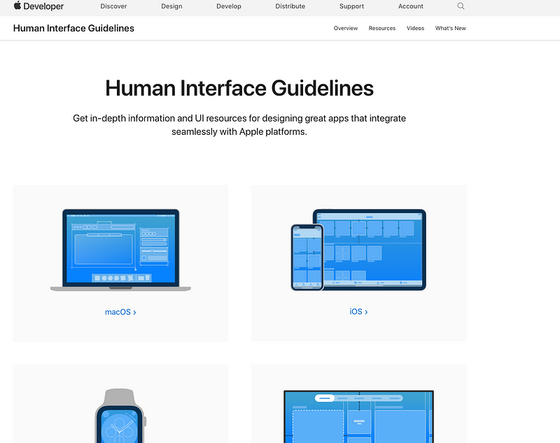
The Human Interface Guidelines (HIG) provide extensive UI resources and insights for all Apple platforms. HIG offers a broad overview of essential UI elements, associated APIs, and best practices, assisting developers in effectively integrating features into their applications.
Section 1.6: Polaris Design System
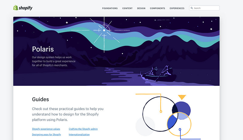
The Polaris Design System from Shopify offers a comprehensive set of principles and guidelines for designers working on Shopify applications and channels. It provides a range of resources and design elements, including patterns, available for all Shopify partners.
The video titled "6 Different Kinds of Design Systems" delves into various established design systems, including Polaris and others.