Optimizing Your Minimalist iPhone Setup for 2024
Written on
Chapter 1: Introduction to a Purposeful iPhone Setup
I view my phone as a multifunctional tool designed to simplify my life, rather than a source of distraction. To achieve this, it's essential to configure my device effectively. Every application on my phone needs to serve a specific function, and I use them with intention. The aim is to minimize screen time while enhancing productivity.
Consequently, I avoid "time sink" applications like social media and games. My phone usage is guided by three primary objectives:
- Enhance productivity.
- Maintain my physical and mental well-being.
- Monitor and improve my financial situation.
To meet these goals without increasing screen time, careful setup is crucial. Below, I will outline my current configuration, illustrating how it boosts my productivity and reduces distractions.
Chapter 1.1: Managing Notifications
Notifications can significantly influence my engagement with my phone. They hold the potential to divert my attention from tasks at hand, whether through sound alerts or badge notifications that tempt me to check apps. To combat this, I turn off notifications for nearly all applications, only keeping them activated for critical ones such as:
- Banking apps
- Task managers
- Calendars
For all other applications, I reactivate notifications only if I find their absence detrimental to my life. Additionally, I disable lock screen previews to resist the urge to glance at notifications without unlocking my device. I also turn off notification badges entirely, as they can provoke unnecessary compulsions to check apps.
Chapter 1.2: Utilizing Focus Modes
The "Do Not Disturb" (DND) feature is a valuable tool for silencing notifications, calls, and texts. I keep DND active for about 60–70% of my day. Recently, Apple introduced Focus Modes, allowing me to tailor notification settings, control who can contact me, and select visible apps on my home screen. I have two custom Focus Modes:
- Workout: This mode prioritizes fitness-related applications and music.
- Sleep: All notifications are muted until my alarm goes off the next morning.

Chapter 2: Customizing the Lock and Home Screens
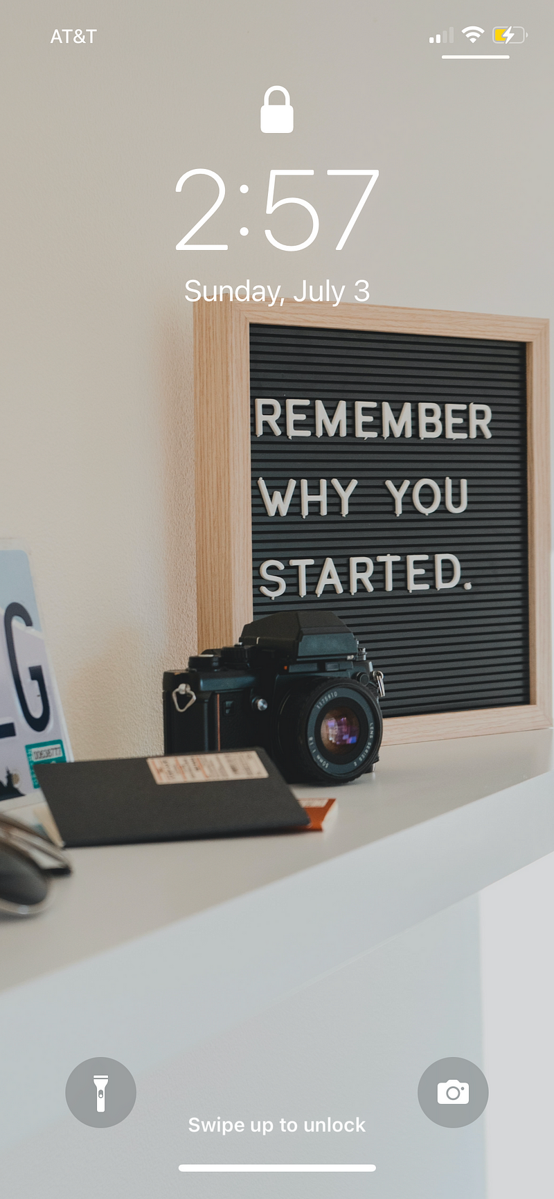
My lock screen is designed to be minimalistic. I conceal notification previews to limit distractions and use an inspiring background image that prevents me from aimlessly swiping through apps. My home screen features a simple black background.
Chapter 2.1: Organizing the Dock
I place my most frequently used applications in the dock for easy access. Here’s how I utilize each app:
- Camera: Capturing moments through photos and videos is a primary function of my phone.
- Home: I control my smart home devices through the Home app, utilizing Siri shortcuts for automation.
- Snipd: My go-to podcast player, ideal for listening while multitasking. It enables me to take notes on podcast highlights.
- TickTick: This serves as my comprehensive task manager, calendar, and habit tracker.
I arrange these applications in order of priority, ensuring that my most-used app, TickTick, is the easiest to reach.

Chapter 2.2: Home Screen Overview
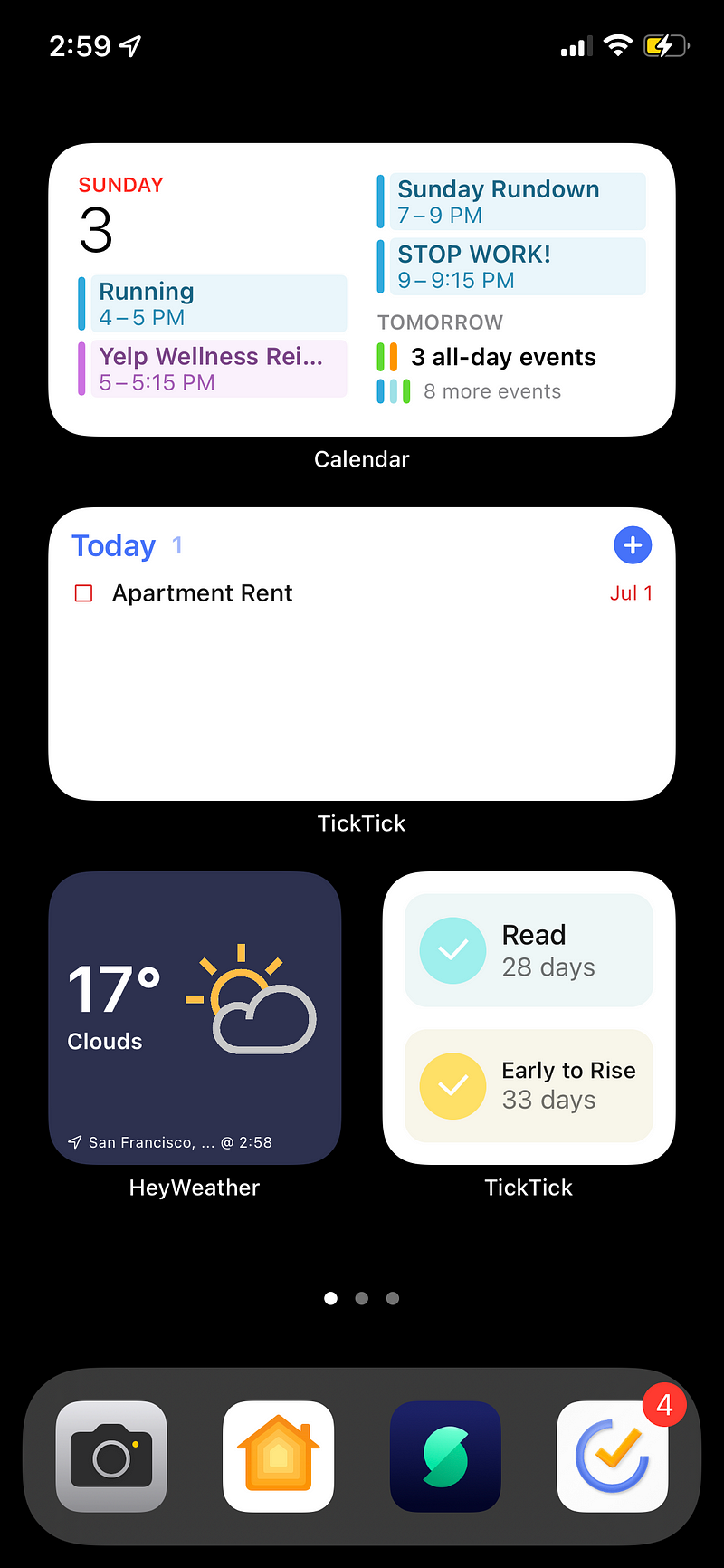
The first page of my home screen is dedicated to productivity. I maximize widget usage for quick access to essential information, opting to forego app icons. Noteworthy widgets include:
- Apple Calendar: Displays my daily events for easy viewing.
- TickTick Tasks: Summarizes my key tasks for the day.
- HeyWeather: Allows for quick checks of the weather.
- Battery Status: Shows the charge levels of all my devices.
- TickTick Habits: Tracks my daily habits at a glance.
This screen serves as my primary hub for productivity.
Chapter 3: Health and Fitness Hub
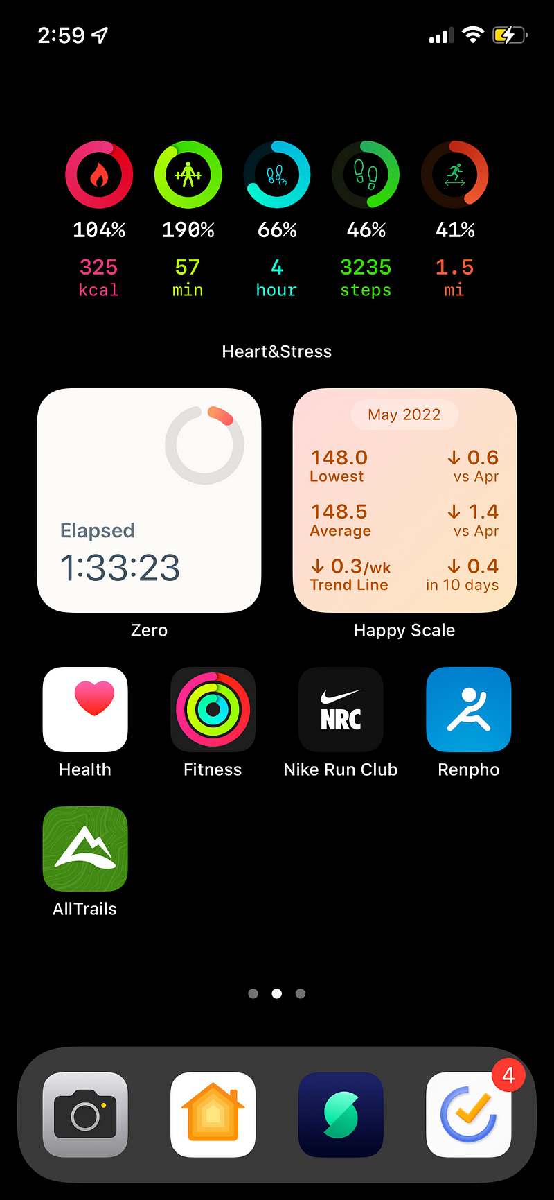
Swiping left leads to my second home screen, focused on health and fitness. This page combines widgets for quick health insights and frequently used workout apps. Key widgets include:
- Heart&Stress: Monitors metrics from my Apple Watch.
- Zero: Tracks my intermittent fasting.
- Happy Scale: Monitors my weight trends.
Essential fitness apps are also easily accessible, ensuring I can track my health effectively.
Chapter 4: Financial Management Hub
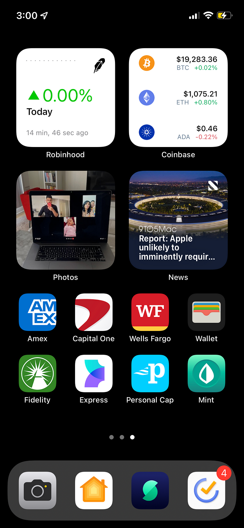
The third home screen serves as my finance hub, consolidating all financial information, including bank accounts, investments, and budgets. Widgets and app icons are strategically placed for quick access to financial data. Notable widgets include:
- Robinhood: Displays portfolio performance.
- Coinbase: Keeps tabs on cryptocurrency investments.
This hub is designed for efficient financial management and tracking.
Chapter 5: App Library and Conclusion
Less frequently used applications reside in the App Library to keep my home screens clutter-free. Key apps include:
- Apple Maps: My navigation app of choice.
- Signal and Messenger: For communication with friends and family.
- Notion: Used primarily on my desktop for planning and organization.
This setup exemplifies my minimalist approach to using my iPhone, emphasizing utility and focus. If you've made it this far, thank you for reading! I'd love to hear about your own phone setups in the comments below.